Action Forum
- Design
- Design Systems & Templates
- Brand Book & Style Guide
- Logo & Identity
Foreword
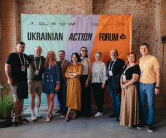
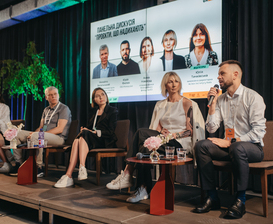
It is clear that we will never see Ukraine as it was before the full-scale invasion. Now, it depends on us whether we will see it better and more innovative. This is exactly why Action Forum Ukraine was established – to support participants in implementing their projects and initiatives through experience sharing and partnership building. This platform brought together hundreds of guests and speakers, representatives of major companies, and owners of small and medium-sized businesses from all corners of Ukraine under one roof. The forum took place in an interactive format – discussions in the style of a “World Café,” interactions with speakers, an artistic breakfast, traditional panel discussions, and lectures.
Task
The client approached us with a request to create the branding and navigation for the forum. It was crucial to visually enhance the core values of Action Forum Ukraine – to help facilitate dialogue between businesses of various scales and social initiatives that contribute to Ukraine’s recovery. In brief, the forum emphasizes three main areas – people, business, and the future development of the country.
Solution
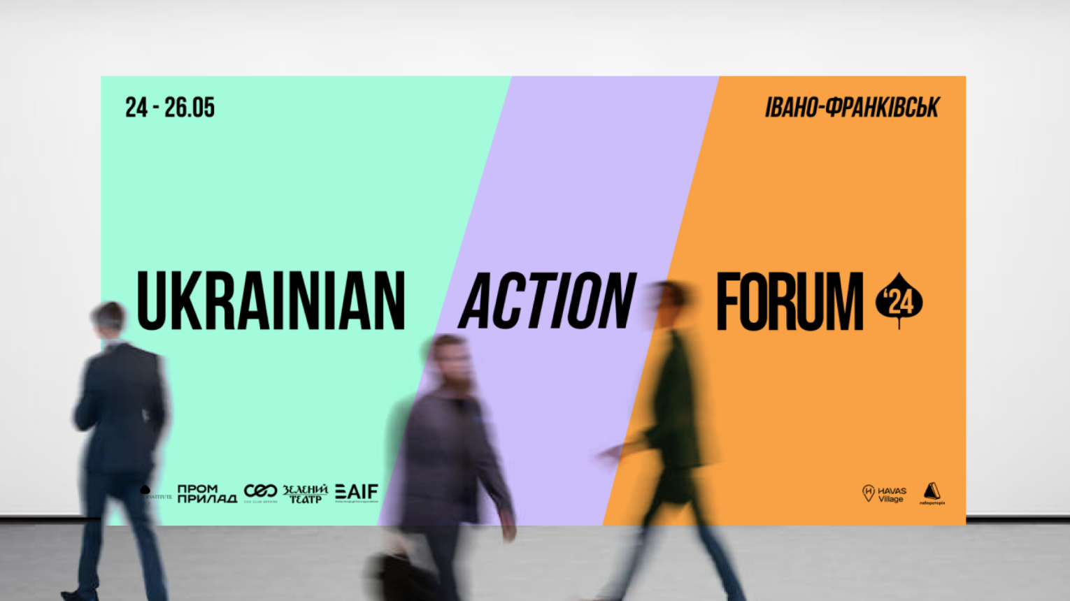
The central theme of the forum was chosen as “Action as Progress” – a constructive and practical approach in our quest for change. To foster the development of Ukraine, action is needed now. Since the forum included both digital and offline media, the concept of movement had to be conveyed in both static and animated formats.
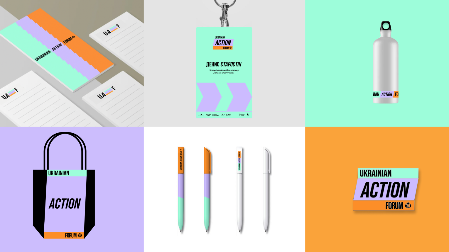
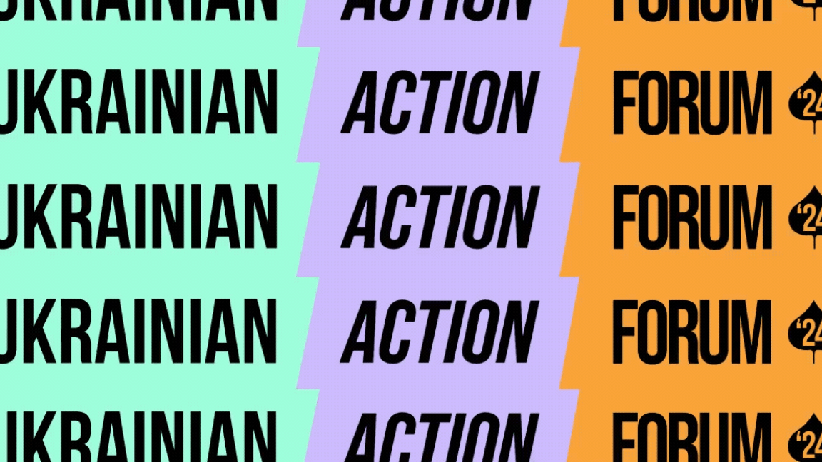
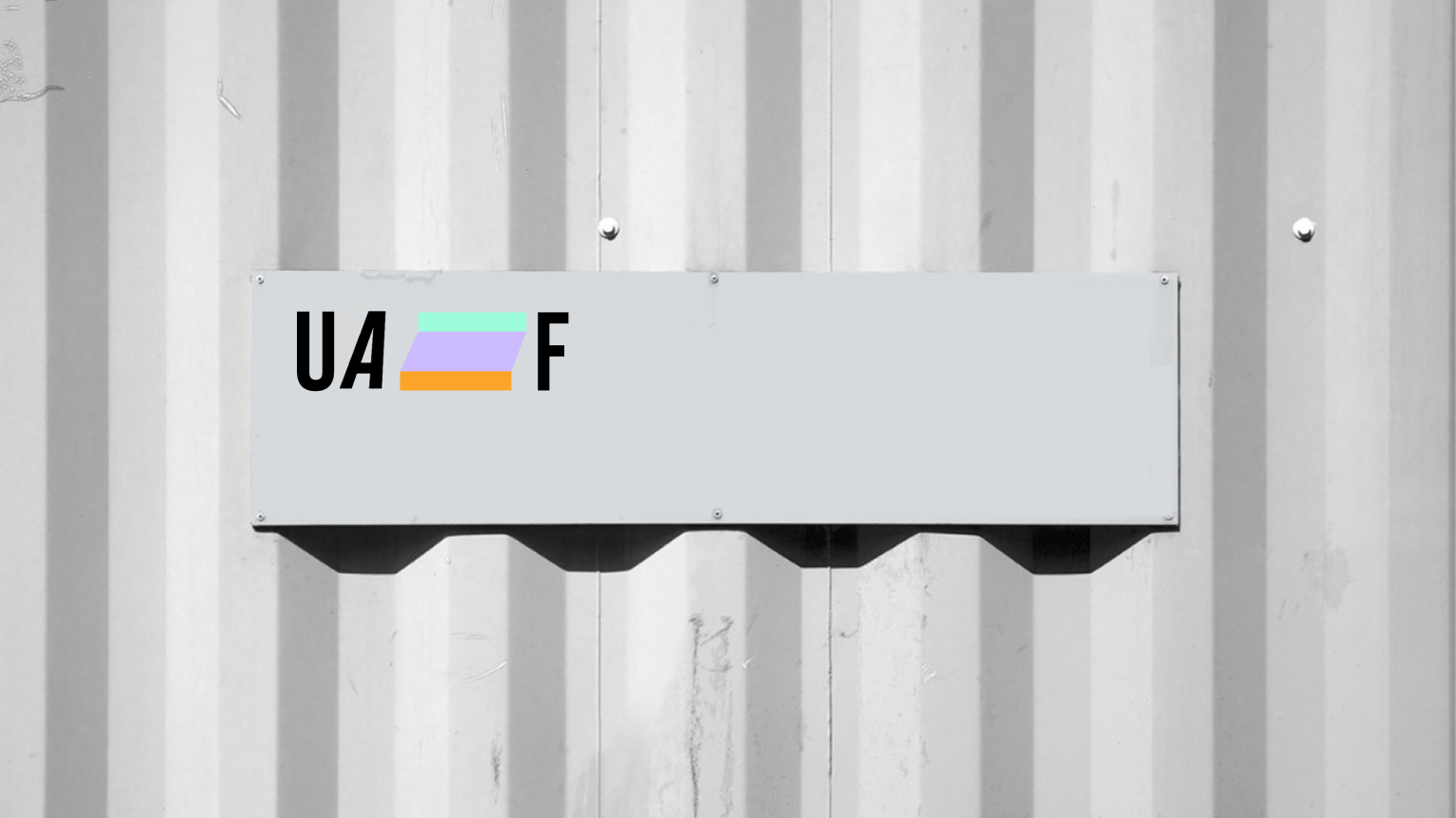
Therefore, for the logo, we chose a block design to integrate the three core values into a single cohesive unit and added a distinctive tilt/movement in the “action” block. This helped us create a sense of dynamism and emphasize that action is the key element connecting people and businesses.
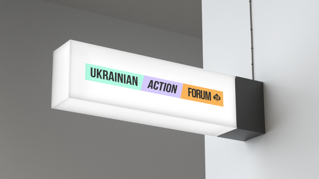
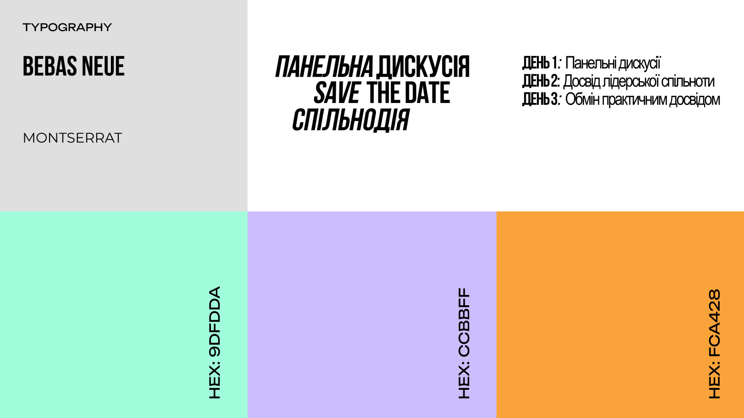
Next, we moved on to finding the color coding for the areas. We translated the main themes (people, business, future) into the forum’s name – “Ukraine,” “action,” and “forum.” This led us to a modern approach to coding, based on the meaning of each color.
UKRAINE (MINT GREEN)
This color symbolizes freshness, safety, and luck. People who prefer mint green are usually creative and open-minded. We believe this represents the renewed Ukraine.
ACTION (LAVENDER PURPLE)
This color encompasses emotions and thought processes – imagination and creativity. It is also associated with spring, symbolizing the optimistic beginning of new phases in life. This is how we envision the development of business and society in Ukraine.
FORUM (ORANGE)
Orange is known for its ability to stimulate feelings, increase energy levels, and encourage socialization. It is often used in design to attract attention and create a sense of pleasant excitement. Psychologically, orange is associated with optimism, enthusiasm, and inspiration for creativity. This is the exact effect we expect from the forum.
It is important that these colors also harmoniously complemented the industrial aesthetics of concrete and brick at the former Promprylad factory, where the forum took place.
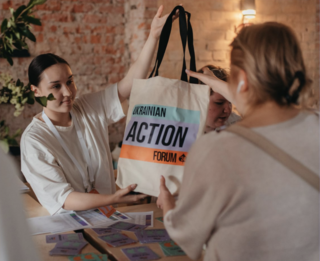
In addition to the standard set of materials, we also prepared logo animations for various formats and a unique pattern for the forum.